Bringing you closer to the
moment of discovery
Discover biological biomarkers, create insights into disease mechanisms, discover new drug targets or identify changes in protein levels from a set of carefully designed experiments.
Get started quickly and experiment continuously
We’ve made it easy to start unlocking the power of MS and Proteomics so you can focus on the biological complexity and move closer to the moment of discovery. Our automated and repeatable workflow allows for quicker experiment startup and turnaround times, giving you the control and flexibility to make and act on decisions in the moment.

A one-stop Proteomics workflow: to make sense of complex proteomics data
Allowing you to focus on biological insights and human-to-human collaboration, our proteomics data processing workflow is built to scale, repeatedly. We’ve pushed heavy and repetitive processing to the cloud, enabling a seamless and enjoyable experience. pInput raw files or pre-processed data - the choice is yours. We support Label-Free Quantitative (LFQ-DDA) and Tandem Mass Tag (TMT) methods.
Big is beautiful
Our intelligent Proteomics workflow seamlessly integrates complex moving parts to enable larger experiments to be processed and analysed with ease. Let us remove big data and other technical constraints, so you can focus on discovering and sharing insights.

Addressing the ‘missing value’ challenge
To give you the best chance of extracting optimum insights from your experiment, our workflow performs machine-learning smarts and an unbiased extraction of MS1 data for every detected feature in your MS files. This helps reduce missing values, maximises data completeness and provides a measure of feature confidence.
Be a #MassGeek anytime, anywhere
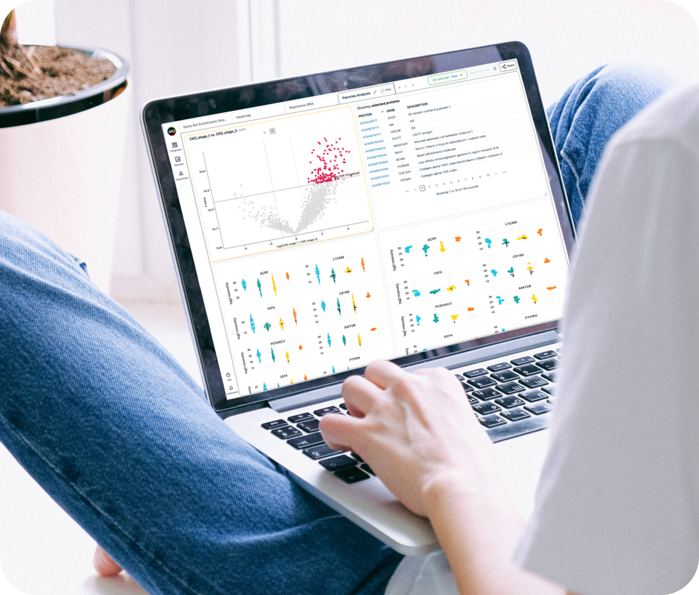
Want to do a quick piece of analysis while you’re commuting to the lab? Make the most of what would typically be idle time. Thanks to the cloud, you can process, analyse and showcase your data or insights in the comfort of your home, a local library or a buzzy cafe.

Take control of quality
Beautiful graphics representing key information that you care about including the overall health of your experiment, the quality of your feature and the completeness of your data.
Don’t go empty-handed to your next lab catchup
Drawing upon existing knowledge in context of your experiment, we assist you with uncovering, communicating and sharing insights. Using our analysis modules, you can build up your evidence over time across many experiments to support the communication of your biological story.

Popular analysis modules
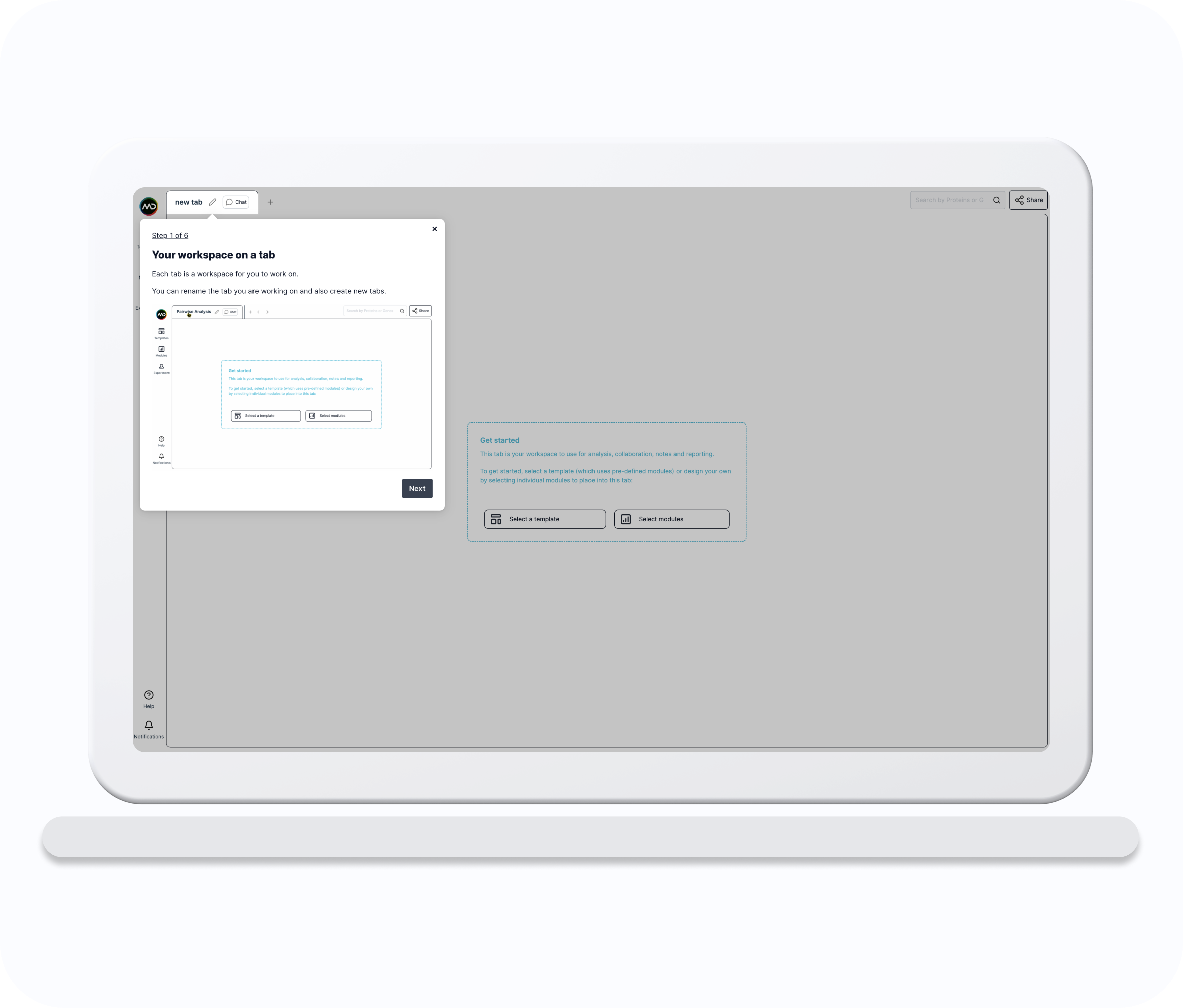
Mass dynamics has been designed in a modular structure where dIfferent visualisations and analysis elements are contained in what we have termed ‘analysis modules’. To start get started simply select a module and drag it into the workspace. You can then drag as many other modules as you wish into the workspace, you can drag them to different positions, and also resize them.
Experiment Design
A table listing groupings of Conditions and Filenames.
Volcano Plot
A plot to explore pairwise differential expression analysis.
List Table
A table listing selected proteins, associated genes and descriptions.
Data Table
A table showing differences between conditions including associated genes and descriptions, log2 ratios, p-values and adjusted p-values.
Violin Plot
A plot to show the probability density distribution of the intensities of selected proteins, by conditions.
Dot Plot
A plot to show the distribution of the intensities of selected proteins, by conditions.
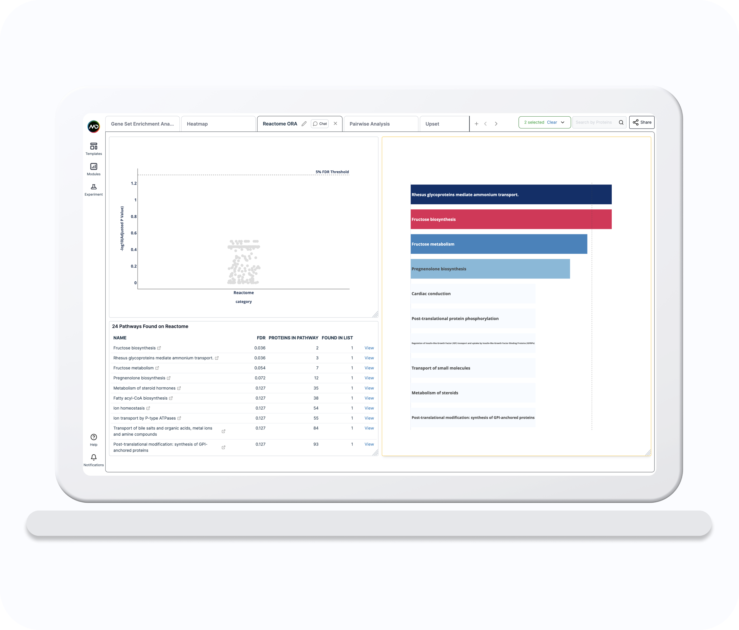
Reactome ORA Table
List of potentially over-represented pathways including estimated False Discovery Rate (FDR) and number of associated proteins.
Reactome ORA Strip
Scatter plot of potentially over-represented pathways ordered by -log10 estimated False Discovery Rate (FDR).
Reactome ORA Bar
Bar plot showing the top n potentially over-represented pathways ordered by -log10 estimated False Discovery Rate (FDR).
GSEA Volcano Plot
A plot to explore the results of the pairwise Gene Set Enrichment Analysis (GSEA) with the CAMERA method, including the average fold change of the proteins in the set and the associated statistical confidence metrics.
GSEA List Table
A table listing the selected enriched gene sets.
GSEA Results Table
A table listing the results of the gene set enrichment analysis (GSEA) with CAMERA.
Upset Plot
A plot showing the intersection of elements across user-defined protein lists.
Text
Write and format text to record insights and notes.
Checklist
Write, format and manage tasks.
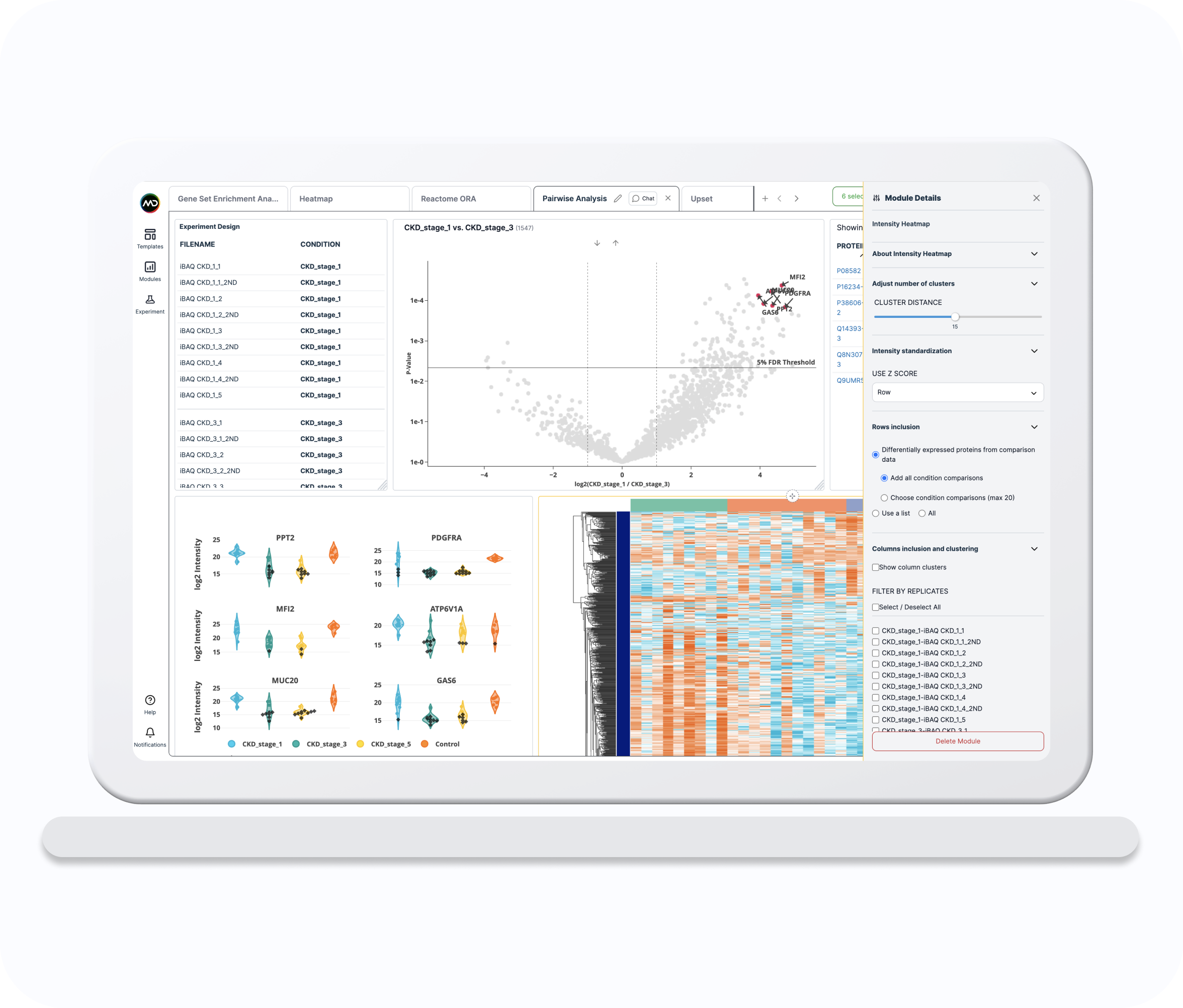
Intensity Heatmap
The Intensity Heatmap shows the log2 intensities (original or imputed) of the selected proteins (rows) across the selected runs (columns).
Correlation Heatmap
The Correlation Heatmap is a symmetric matrix showing the protein-protein Pearson's correlations using the log2 intensities (original or imputed) of the selected proteins.
Popular templates
We have grouped pre-defined sets of analysis modules that you are likely to use for a particular type of analysis into templates. After selecting a template, your workspace will be pre-populated with a defined selection of modules for you to use. You can add additional analysis modules into the workspace or delete analysis modules from a template.
Quality Control Report
The QC Report template helps you quickly assess several aspects of your experiment quality. It allows you to gain confidence about the health of your experiment prior to investing time in the analysis and results interpretation.
Upset
The Upset template shows set intersections between user-created protein lists.
Reactome ORA
The Reactome Over Representation Analysis (ORA) template combines several visualisations and a summary table to allow you to perform an ORA with user-selected protein lists to identify pathways relevant to the study.
Gene Set Enrichment Analysis (GSEA)
The GSEA template allows users to quickly run and explore enrichment results performed with the CAMERA method for several pairwise comparisons and knowledge databases.
Pairwise Analysis
The Pairwise Analysis template allows you to interactively explore the differential expression results by combining volcano and intensity distribution plots with the table listing the selected proteins.
Heatmap
The Heatmap template combines Intensity and Correlation heatmaps. It allows you to quickly visualise your protein expression patterns and cluster proteins which express in a similar way across your samples.